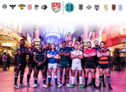
Major League Rugby Brands Ranked Best to Worst
I'm an amateur-bordering-semi-pro graphic artist slash American rugby fan. When I heard the news that Major League Rugby was starting up from the ashes of PRO Rugby, my first exclamation was "show me the logos!" Since then, I've been ranking the marks of each team in my mind. With the recent addition of "Giltinis" in Los Angeles, I feel compelled to share my thoughts with the world.
This list is a ranking of the brands, not just the logos and the team names. For the uninitiated, a brand is the sum of impressions of a product or service. This may include jerseys, social media effort, broadcasting quality, fan culture, team culture, and even success on the field. That said, the name and logo are the heaviest influences in my ranking and other elements are brought in to sort of break up ties. This is also fraught with bias, but I try to be obvious as much as possible and can only hope that it hasn't influenced the rankings that much.
Let's have fun.
#1 - SEATTLE SEAWOLVES
It may be getting a little old now but the Seawolves win again. The name itself is a great start, place+mascot. And a good mascot. Not only that, but the name and logo tie into other sports brands in the area including Seattle Seahawks and Vancouver Canucks. Some may think this is a ripoff but it's a strategic choice tapping into existing fan-bases. And boy did it work! Seattle boasts the largest and most rambunctious fan-base in MLR. The logo is sharp and distinct. The colors are great, it's well illustrated, and it's shape and simplistic design make it ideal for all sorts of applications. That's incredibly important for a sport brand which plasters a logo everywhere. This is admittedly not my favorite logo. It's great, but the next one slightly edges this one out. It's the homages to other teams, the fanatic fans, and winning both inaugural titles that puts Seattle's brand on top.
#2 - UTAH WARRIORS
Yes! This is a great logo. I don't even root for Utah, but I have a sweatshirt of theirs. I almost gave these guys the number one spot, but this is not just a logo list. Like Seattle, the name is great and boy-howdy, what a fierce mascot it is too! It screams rugby. The ball gives it away to new fans. However, the painted warrior face (or mask? who cares!) while somewhat culturally ambiguous, does give a nostalgic nod toward Pacific islands that are famous for generating some of the best rugby warriors in the world. Technically, the logo is perfect. The color scheme is striking and the bold lines and simplistic style make this easily recognizable in even the tiniest of forms, such as a browser favicon or lapel pins. Now if only their success in graphic design would translate into success on the pitch.
#3 - TORONTO ARROWS
I love word marks and monograms. Toronto is very different but the brand does succeed in very much the same way the two above do. Here we have another very respectable team name in the American style: place+mascot, and it doesn't suffer from an ambiguous name many below do. The TA monogram in the middle also looks great on it's own as a diminutive mark, and works well to identify the team in tiny format. This is especially important on fixture/ranking tables online and scoreboards far away. Lastly, Toronto may have the best motto/hashtag: #arrowsup! It means "get ready mother f***ers!" It connotes a line of archers drawing strings about to obliterate their enemies and there's some cheeky, macho innuendo to boot.
#4 - HOUSTON SABERCATS
Aside from the obviously patriotic NE Free Jacks and DC Glory, nothing screams American sports team more than a Texas town + fierce animal mascot. Houston, you nailed it. I have mixed feelings about the logo. The word-mark in the top is grand. The font, the colors, the subtle gradient, and the kitty scratches work really well together. But the sabercat looks a bit forced. Is he gagging on the ball? For whatever reason, it reminds me of Dennis Quaid stuck in the dragons' mouth in Dragonheart. But that's my fault for loving that horrible film. By the way, how come no MLR team has picked up dragons as their icon?
#5 - NOLA GOLD

Ah ... the shields. We're coming into them now. Friends of mine are aware of my esoteric and obnoxious hobby interest in heraldry and flags. They'll be surprised to hear I'm not generally fond of the shield logos in MLR. It's a picky thing, I won't get into it on this post, but I just don't like words or letters on shields and flags. NOLA does it best, though. What I like most is that this is exactly what one would expect to come out of New Orleans. The gold and the crown are ostentatious, but bold and appropriate. I dig it. Unlike some other MLR shields, I can read these letters. I also approve of their more recent usage of Mardi Gras colors green and purple, sneaking into their marketing and the crown helps them stand out as well. It's distinct, which is probably the most important thing, not only in branding, but also heraldry and flags. Lastly, I can't put my finger on it, but there's something about the city name truncation "NOLA" that works well, but doesn't for places like "ATL."
#6 - OLD GLORY DC
This sits appropriately in the middle of the list as I neither love or hate it. It is unremarkable. The choice to put the city name, DC, after the mascot instead of before is curious. It vaguely sounds European, but I couldn't find any teams that matched this naming convention exactly. Old Glory is a perfectly acceptable mascot, especially for our nations capitol. However, I wish Old Glory - ie the American flag - appeared more prominently. Instead its design is partially painted on a shield rather than a flag. Inclusion of the US Capitol Building is an interesting choice as well. I get it, we're in Washington D.C. ... but isn't that building full of controversial characters? Wouldn't the flag, Old Glory, have been enough? That said, I like that you can read the name, and I appreciate the gritty texture. Old Glory and Free Jacks are practically tied. The pros of New England's brand are superior to Seattle's, but the cons are more offensive.
#7 - NEW ENGLAND FREE JACKS
Full disclosure, I'm from New England, but I have so many mixed feelings about this one. I'll try to keep it short. The patriotic theme is great. The revolutionary spirit is alive. Just like Seattle, the Free Jacks have tapped into existing local sports fan markets with an homage to both New England Patriots and New England Revolution. And just like Seattle, it worked. The Free Jacks were on track to break records in ticket sales before the season was cancelled. I also have an appreciation for classical styles, and the rough edges and rich history call to me. I also was stoked they were the only team with classic rugby jersey collars. However, the Free Jacks fall short in another area. The logo (actually logos, they have two, the other featuring Jack... erm ... Paul Revere on a horse) are both too complex and detailed and are completely unrecognizable in small or distant formats. They look great screen pressed on a t-shirt, but that's about it. Also having multiple logos is good and common for sports teams, but there are marketing needs unmet by theirs. Also, what is a Free Jack? According to the team, it's made up. It of course alludes to revolutionary actors, but it was not a term used historically. Coincidentally, prior to the launch announcement of the team, I was working on hypothetical brand called the Boston Jacks, with a playing card motif.
#8 - SAN DIEGO LEGION
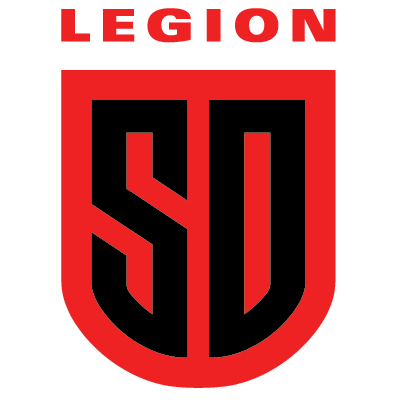
San Diego Legion has so much potential. The theme is great. It blows my mind more sports teams don't use themes from Greco-Roman antiquity with so many lauded warrior types, heroes, and mythical creatures! Where San Diego fails is the logo itself. Black and red make great partners in a color scheme, a la Utah, but putting one right on the other physically hurts the eyes. The logo is also boring but more importantly it doesn't even incorporate Roman symbols or imagery! Rome has a RICH visual history, ripe for the picking. Instead, it's just two letters on a shield. The shield isn't even Roman in style, it's medieval, and the letters are way too modern. I got bored one day and made my own SD Legion logo. They're free for the team to use it if they want. San Diego, if you do work on that logo, just be very careful with Roman style eagles and avoid the fasces.
#9 - RUGBY ATL
YAWN. When Atlanta announced their new team was joining the franchise I thought Rugby ATL was just a placeholder name. But they've sat on it long enough, it appears to be sticking around. Ok, I like their stylized letter A a bit. But that's it. Why not stylize all of ATL and go for a monogram like Toronto? Why go with ATL, your airport code, in the first place? It makes little sense to me. Also fussing around with the word order, initials, etc is lazy and uninspiring. Just go with "Atlanta Rugby" if you want to be the clearest about what you are. Better yet, why not Atlantic Rugby and go with a tempestuous ocean or wave icon? I actually used to own the domain, atlanticrugby.com. I wish I hadn't let it lapse.
#10 - RUGBY UNITED NEW YORK
New York, you are SO lucky Adam Gilchrist now owns two other MLR teams. For a long time you sat on the rock bottom of my list and not just because I'm two hours from Boston and detest how you grill lobster. Let's start with the fact that NYC is arguably the world capital of business, marketing, and design... and this is what they came up with? This is the same town where the WORLD's most recognizable team, the Yankees, comes from. First, the name: Rugby United New York. It's obvious you've forced this word order so that you'd have the nice acronym, RUNY. But the city name always goes before "United," such as "Manchester United" or "Newcastle United" and alludes to the merger of previous teams ... how ballsy of you to have united all of Rugby. The logo is incredibly awkward. It's too tall. A logo of equal height and width, or slightly greater width, fits on most applications. Yours will only fit comfortably on a pencil... or maybe a website with a rare left aligned navigation menu. And the NY letters on the shield ... they're illegible. Not in a fancy calligraphy kind of way but in a all-we-have-left-to-work-with-is-popsicle-sticks kind of way. I'll give you some credit. The color scheme is great and connects you to other NY sports teams. I also liked the pinstriped jerseys. It's not how I would dress, but the homage and the bravery was there. Of course all of the above is said with northern love. Now let's bash Gil.
#11 - L4 GILTINIS

I almost lumped LA and Austin together, but there's plenty to say about both and between the two there is a winner. For those unaware, both the LA and Austin teams received substantial enough investments to warrant naming after made-up cocktails (which are rip-offs of existing cocktails) that are also named after the business owner and aspiring mixologist, Adam Gilchrist. Unlike the Texas team, I at least know what a martini is... but who goes to a rugby drink up and orders a martini anyway? I'm drinking beer after every game and then if I stay out late with the lads, I'm ordering whatever keeps me stupid and going: vodka-red bull and jello shots. The Gilification of the teams puts the owner's pride over the fan's and player's enjoyment. It is abhorrent marketing and cheapens the sport. Also the style of the rugby olive doesn't match the rest of the logo and the A looks more like a 4.
#12 - AUSTIN GILGRONIS
Austin. I am so sorry. The Austin team has had a tumultuous life. It was reflected in their brand changes each season as well. From a logo/naming standpoint they went from good to great to hell. They started as Austin Elite Rugby, which was an OK name, but their shield logo was fantastic and ultra-Texas. You know what, here it is, it deserves your attention:

Then the first name change came along and it was a marked improvement. Austin Elite became Austin Herd. It had so many good things going for it: it was logical, distinctive, relevant, short, animalistic ... great. Austin Herd was in my top three MLR brands, but then came along the Australian investors with a fetish for themselves. Why does the Gilgronis brand fall short of the Giltinis? First, Gilgronis sounds like your hacking up flem. There's also the fall from grace itself, whereas the Giltinis emerged already shitty with less resentment. Lastly, the logo is garbage. It is cheap, because they couldn't afford a graphic artist to spend one half hour fixing this:
 Unless those little spikes are their failed attempt at giving their warped map of the lone star state spurs, they are signs that the vector graphic has too many anchor points and is absolutely lazy craftsmanship. It's embarrassing. It is bullshit, or maybe bullpuke, as if the previous steer logo drank too many Gilgronis and vomited this out onto hot Texas asphalt behind the dumpster at a needle-strewn rugby pitch.
IN CONCLUSION
If you've read this far, I thank you for taking the time. It was good to get this off my chest. I'm curious what others think. No doubt there will be dissenting opinions.
Apologies to the Colorado Raptors for your exclusion. Your departure from MLR came shortly before I drafted this. Looking back, you probably would have sat comfortably above Old Glory, but we'll never know now for certain.